The Score Is the Hero: How QuickStave Renders Sheet Music in the Browser
Canvas vs SVG, staff-space coordinates, floating beams, and the virtual viewport that made a 300-bar Mozart sonata scroll smoothly on a six-year-old phone.
Professional notation software — Sibelius, Dorico, Finale (rest in peace) — is desktop-only, heavy, and expensive. Meanwhile, Figma replaced Illustrator in a browser tab. Google Docs replaced Word. Music notation was overdue for the same treatment.
QuickStave is a web-based notation editor. Open a URL, start writing music. No install. No licence dongle. That pitch is easy to say and brutally hard to deliver, because rendering sheet music well is one of the most demanding 2D layout problems you can attempt in the browser.
This post is about how the rendering engine works, what went wrong along the way, and the single design philosophy that drives every decision: the score is the hero.
Why Canvas, not SVG
Early on we made a deliberate architectural split: a layout engine that produces an abstract list of positioned elements — glyphs, lines, curves — in staff-space coordinates, and a rendering backend that paints them. Today that backend is HTML Canvas 2D, but the separation means we could swap in WebGL, OffscreenCanvas, or even a native renderer without rewriting the layout logic. We wanted that flexibility from the start, in case Canvas performance turned out to be a dead end.
We chose Canvas over SVG for a pragmatic reason: a single orchestral page can contain thousands of elements — noteheads, stems, beams, slurs, accidentals, dynamics, lyrics. SVG means thousands of DOM nodes. The browser’s layout engine would be doing collision detection on objects it knows nothing about, fighting us every step of the way. With Canvas we own every pixel and every draw call. There’s no reflow, no style recalculation, no mystery performance cliff.
Staff-space coordinates
The renderer works entirely in staff-space units — one staff-space equals the distance between two adjacent staff lines. Every notehead, every beam, every tuplet bracket is positioned in this abstract coordinate system. Pixels only appear at the very last step, when the canvas multiplies by a single scale factor.
This matters more than it sounds. Zoom is free — just change the multiplier. High-DPI rendering is free — multiply by the device pixel ratio. And the layout engine can be tested with pure arithmetic, no canvas required.
A simplified view of the pipeline:
Score (data model)
  → layoutScore()  →  RenderElement[]  (staff-space coordinates)
  → Canvas2DRenderer.render()  →  pixels on screen
Each measure goes through multiple passes: horizontal spacing based on duration, stem direction, beam grouping, then collision avoidance via north/south skylines — bounding envelopes that track the highest and lowest occupied point at each x-position. When we place a dynamic marking or a tuplet bracket, we query the skyline to find clear space. No overlaps, no manual nudging.
Beams: the problem that kept coming back
Of all the layout challenges — line-breaking, spacing, slurs, ties — the one that caused the most persistent grief was beaming. Beamed groups of eighth notes, sixteenth notes, and beyond need to share a single angled beam line that connects all their stems. Get the angle wrong by a fraction of a staff-space and the beam visually detaches from the noteheads. We had beams floating away from their notes more times than I’d like to admit.
The core issue is precision. Tuplets — triplets, quintuplets, and so on — produce durations like ⅔ of a beat. Accumulate those as floating-point numbers and you get rounding drift: a note lands on beat 2.9999999 instead of beat 3, and the beam-grouping algorithm puts it in the wrong group. We solved this with integer tick arithmetic — a high-resolution tick grid where even the most exotic tuplet ratio maps to a whole number. No floats, no drift, no runaway beams.
The wall: large scores on mobile
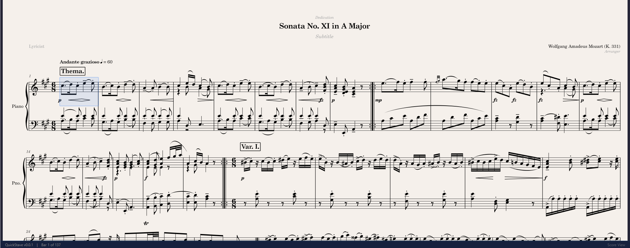
QuickStave worked beautifully on desktop from early on. Then we loaded Mozart’s 12 Variations on “Ah vous dirai-je, Maman” — over 300 measures — on a Samsung Galaxy A71. That’s a midrange Android phone, already over six years old. It’s also the device I personally use every day, which makes it the unofficial benchmark for “fast enough.”
The score rendered correctly, but at single-digit frame rates. Scrolling was agony.
The bottleneck wasn’t layout computation — that was already fast. It was the canvas itself. A 300-bar score at full zoom produces a canvas tens of thousands of physical pixels tall. The GPU on a midrange phone simply can’t fill that many pixels at 60fps, no matter how optimised the draw calls are.
We had two earlier mitigations: capping the device pixel ratio at 2× on mobile, and defaulting to 75% zoom. Both helped but didn’t fundamentally solve the problem.
The real fix was viewport-culled rendering. Instead of painting the entire score onto one enormous canvas, we size the canvas to the visible viewport plus a buffer zone, keep a spacer element at the full score height so the browser’s native scrollbar works naturally, and only paint the systems that are actually on screen. The layout engine computes everything once and caches it; the renderer just filters by Y-range on each frame.
The difference was night and day. The same 300-bar Mozart piece now scrolls smoothly on that same A71.
Looking like Dorico
We use the Bravura music font via the SMuFL standard (Standard Music Font Layout). This was a conscious choice. Our goal is engraving quality on par with Dorico — the current gold standard in notation aesthetics. When a Dorico user opens a score in QuickStave, the noteheads, rests, clefs, and accidentals should look exactly as expected. It’s the same font, the same glyph set, the same design sensibility.
Integrating a music font into Canvas is straightforward in principle — fillText() with Unicode codepoints in the Private Use Area — but the details matter. Glyph metrics, bounding boxes, and anchor points all need to be pixel-accurate. SMuFL defines these precisely, which saves an enormous amount of trial and error.
The score is the hero
The philosophy that drives every rendering decision in QuickStave is simple: the score is the hero. It should gracefully fill whatever space it’s given — a 4K desktop monitor, a tablet in landscape, a phone held vertically on the bus. It should scroll smoothly. And when you change a note, the relayout should be so fast you never think about it.
This is what people actually want from a notation editor. Not chrome, not toolbars, not settings panels. A beautiful score that responds instantly to their input. Everything else is in service of that.
What’s next
We’re actively building multi-select — the ability to select a range of notes and operate on them as a group. It sounds simple but it’s one of the most important features for reaching a flow state while composing. When you can select four bars, transpose them up a third, copy them to the horns, and keep writing — that’s when the tool disappears and the music takes over.
That’s the real benchmark. Not frames per second. Not layout passes per millisecond. The real benchmark is: did you forget you were using software?